The Client
Fandango is the go-to destination for more than 36 million moviegoers each month. Fandango helps movie fans discover and buy tickets for movies both online and through a mobile app.
The Challenge
Fandango’s ticketing system currently only servies the movie theater industry. As UX Designers, our team of three people was tasked with integrating a feature to sell tickets to local and live events into their current mobile app. Users must be able to discover local events, buy tickets to them, and use the app itself as the ticket at the venue.
Our Role
By playing the role of a UX team working on a feature integration, we had the ability to simulate the actions a company like Fandango would take to integrate an entirely new service into their existing app, thereby expanding their business and reach. We, as designers, were able to learn the process involved in feature integration, as opposed to building a new application from scratch.
Constraints
Two-week design sprint, including all research, designing, prototyping and testing.
Research Phase
Initial Assumptions
To begin, we made some initial assumptions about what users might want in their event-going experience:
-
Movie lovers also want to go to live events
-
People think live events are bigger scale and more expensive
-
People tend to go to movies/shows with friends
-
Buying tickets isn’t hard, but splitting is a pain
To assess these assumptions, we did user research to learn what our users wanted.
User Interviews
We used a screener survey to find five people we could interview in depth to learn of trends and pain points in the ticket-buying process.
We interviewed five total people about their ticket-buying and event-going habits. Some key questions we asked involved:
-
Why do you buy tickets online / What kind of events / With Whom
-
Feelings about the buying process
-
Past experience of using tickets (in any form)
-
Ideal live event experiences
-
Primary conditions for buy tickets
Synthesis
We created an affinity map to synthesize our interview results. From this, we developed several statements that summarized our users’ feelings and desires.


We began by putting each comment from our interviewees onto post-its color-coded by user.
Then we rearranged the comments by theme to find common themes and trends. From these trends we developed key insights.
Some of our key insights include:
-
“I want a good deal.”
-
“We need to buy tickets together buy pay separately.”
-
“I prefer to get tickets on my phone.”
-
“I will pay more for a better experience.”
-
“I want a simple payment process.”
Personas
We made two personas to encapsulate our users’ desires and goals to make sure that what we design reflects our research. By focusing on Kyla, our primary persona, as we designed, we could ensure we were always designing for our users.

Our primary persona, Kyla, is a “concert junkie” who goes to many small-scale local shows, often with friends. Her biggest pain point is getting her friends to pay her back for tickets she bought.

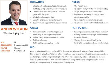
Our secondary persona, Andrew, goes to more expensive, large-scale events like opera and football games. He wants to be able to buy large blocks of the best available seats.
Problem Statement
With our research complete, we adjusted our initial assumptions based on our research to develop a concrete problem statement:
“How might we integrate live event ticket sales and redemption features that are “shareable” within the existing Fandango App?”
Our primary solution to this statement was to integrate a live events tab into the existing Fandango mobile app.
Design Phase
Feature Prioritization
To begin our design process, we first discussed key design elements that could solve the issues we discovered from our user research.

With these ideas in mind, in order to prevent “featuritis,” the overpacking of features into our design, we created a feature prioritization matrix to determine the feasibility of design features, and then a MoSCoW Map (Must Have/Should Have/Could Have/Won’t Have) to determine final feature priority. As we began designing, we included all features in the Must Have section and as many from the Should Have category that were possible given our constraints.


Design Studio
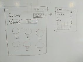
With our features determined, we ran a design studio to quickly ideate design possibilities. We ran 7 rounds of design studio, each one consisting of individual hand sketching, pitching our ideas to each other, another round of sketching, and final discussion and sketching of screens and flows.

Part 1: Hand-drawn sketches, discussion, and more sketches.

Home Screen and Filter Pop-up

Select Seats

Send Ticket to a Friend
Mid-Fidelity Wireframes
From our hand-drawn sketches, we created black-and-white mid-fidelity wireframes in Sketch, following our design ideas drawn from user research. Using these wireframes, we created a prototype using InVision, with which we ran our first usability tests.

Click to Enlarge

Click to Enlarge

Click to Enlarge
Usability Testing - R1
Using our mid-fi prototype, we had five users complete three tasks to test the utility and usability of our designs. From our tests, we gleaned the several insights and developed design ideas to address them.


Our Insights from the first round of usability testing and the design ideas we developed to address them
High-Fidelity Upgrades
As we implemented our design recommendations, we increased the fidelity of our screens to full-color mockups and created a new high-fidelity prototype. We ran a second round of usability testing on this prototype.


Samples of our upgrades from mid-fidelity wireframes to high-fidelity mockups based on usability test results. Click any image to enlarge.
Usability Testing - R2
Our second round of usability tests showed us that our redesigns were largely successful. The insights we gleaned from the results led to only minor design tweaks to improve performance and alleviate user confusion.

"It's cool that you can get movies and live events in one app!"
- 2nd round usability tester
Final Prototype
Integrating these relatively minor design changes, we arrived at our final prototype.
Note: Unfortunately, due to InVision's closing as of January 1, 2025, a live prototype is no longer available. I apologize for the inconvenience.
Next Steps
Due to our time constraints, we did not have the opportunity to test our final prototype with new users. This would be the first thing to do were we to move forward. Other next steps include:
-
Iterate again on our most recent designs
-
Detailed seating chart, allowing users to pick seats directly
-
See the View from your seat before purchasing
-
Pop-up and/or Push Notifications when an outstanding ticket has been paid for
-
Integration with Venmo for payment options
